

Thursday, 23 December 2010

Wednesday, 17 November 2010


Monday, 15 November 2010


Sunday, 14 November 2010


Tuesday, 9 November 2010


Saturday, 6 November 2010


Grad 1 Project
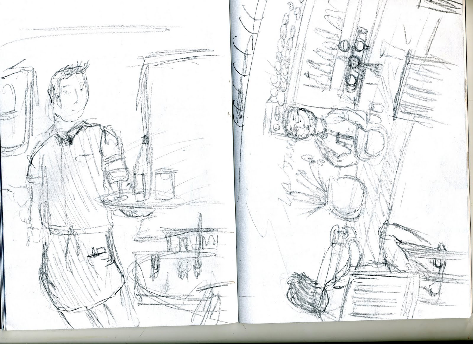

 Initial drawings for Grad 1 project: People on the street quick drawings as they pass
Friday, 19 March 2010
The End Of The Line
This was a 6 week project titled 'The End Of The Line' and we where asked to produce a book cover(front, back and spine) for the book that is also titled 'The End Of The Line'. The book was created to make people aware of the problem of unsustainable fishing and therefore the cover had to also project this image.
Here are a few photos of my progression throughout this project to give you an idea of the steps I took to create the book cover.
The Workspace

Initial Ideas
Here are my initial ideas, Mark making and some of my font development work. I have included images that show how I have created my final piece from all the origional ideas.


Spray Paint Experimentation
Spray paint was one of the medias throughout this project that i thought worked well with all my designs. Here are just some examples of a sprayed text and fish i used during the development stage of the project.


Pen and Ink
I have not used inks much in previous work to this project but i will be using it from now on as it is such a diverse substance and when combined with pen ink the contrast always seems to look really professional.


Mark Making
Here is just one of my pages of mark making i did at the begining of the project to try and build up some ideas of where to take the project.

Final Design
I am happy with how my final design came out, it includes alot of different medias and I like how they all work well together. When deciding where to place the blue swirl i had the most difficulty as it was far to over powering when i used the full image on the front cover so i have croped the edges of it and I really like the outcome.


Thursday, 19 November 2009
2nd Year Graphic Design: this is the year i have had to make some choices as to what i want to specialize in for the rest of the course. I have chosen to do illustration as i feel the free hand work i produce has a very illustrative feel to it and after seeing all my possible options of what i could focus in on i feel this will offer me the right help to make me develop in to a working illustrator.
Sunday, 20 September 2009
Building Project

 This Brief was all about going out in to sheffield and finding a building that I found interesting to look at and also had a bit of history to it. I chose the Leadmill nightclub which is set on leadmill road just outside the centre of town. I chose this building because it is not only a night club, it has also been the starting point for many big bands to come out of this country as it is also a music venue. I also chose the building for its looks, as i would have to use these in my design work,and been a old mill it was full of features.
 I started my design work by exploring new techniques such as aluminium etching, where you make one piece of aluminium with your own design etched on it, then ink up the metal plate and print it onto your chosen media. above are two examples of some etching prints i did of the leadmill, both about A5 in size.


In the brief i was told to create a poster with both text and image in. I then started to look
at perspective and thought about mixing both an image of leadmill i had hand drawn with a text i had hand drawn both going in to a distant vanishing point as this is how the building looks when looking at it from the end of the road.
I was really pleased with how the two elements (the Building and the text) came together as one in this piece, both going off into the same vanishing point at the end of the road. I decided to use a bright red for the text to make it stand out from the image of the building which is just the outline of it.
Buy Nothing Day

In the end i decided to go with a simple design which consisted of a child like drawing of a tree and the sun. I decided to do this as i think the concept of the buy nothing day is very simple in that you dont have to do anything to be part of it, so i thought the poster should reflect this. As you can see i used Sagmeister as my main influence for my text by copying his scruffy font which is sometimes not easy to read like a child writing. I feel this fits in well with the simple background.


Subscribe to:
Posts (Atom)