

Thursday, 22 November 2012

Tuesday, 6 November 2012


Thursday, 18 October 2012


Wednesday, 3 October 2012


Here is a bit of development for a Logo that I am creating for Hornsea Floral Hall. The top one has been sent to me by a student from a school in Hornsea and the two below are my initial developments of it. The first one I did (Middle one) shows how the original could be reworked but looks a bit too rigid for where it is going to be used. The bottom image is my favorite so far as it is a bit more playful and captures the feel of the seaside more as a Logo. This is still a work in process.


Monday, 1 October 2012
Freelance work

Friday, 6 May 2011


Thursday, 5 May 2011


Tuesday, 22 March 2011

Tuesday, 15 March 2011
Childrens Book.
All images folded down middle, Front cover folded back on itself, still unfinished !


Monday, 7 February 2011


Thursday, 6 January 2011

Thursday, 23 December 2010

Wednesday, 17 November 2010


Monday, 15 November 2010


Sunday, 14 November 2010


Tuesday, 9 November 2010


Saturday, 6 November 2010


Grad 1 Project
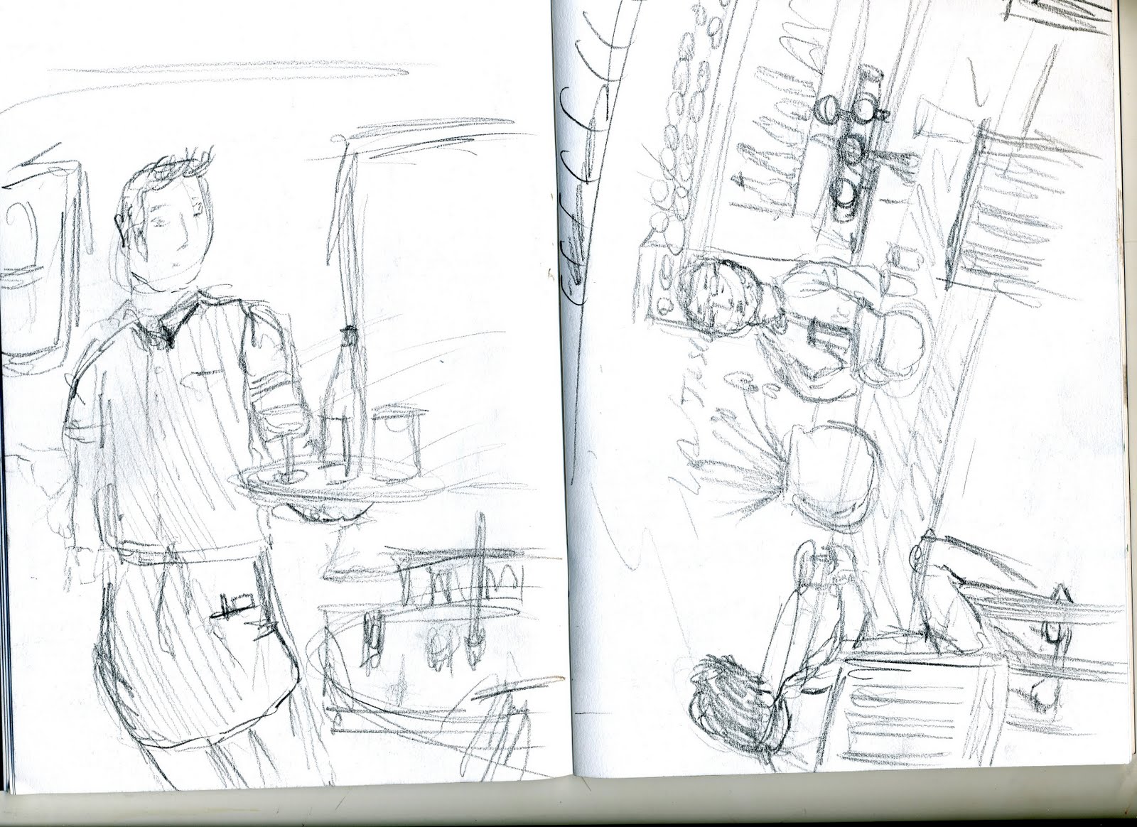

 Initial drawings for Grad 1 project: People on the street quick drawings as they pass
Friday, 19 March 2010
The End Of The Line
This was a 6 week project titled 'The End Of The Line' and we where asked to produce a book cover(front, back and spine) for the book that is also titled 'The End Of The Line'. The book was created to make people aware of the problem of unsustainable fishing and therefore the cover had to also project this image.
Here are a few photos of my progression throughout this project to give you an idea of the steps I took to create the book cover.
The Workspace

Initial Ideas
Here are my initial ideas, Mark making and some of my font development work. I have included images that show how I have created my final piece from all the origional ideas.


Spray Paint Experimentation
Spray paint was one of the medias throughout this project that i thought worked well with all my designs. Here are just some examples of a sprayed text and fish i used during the development stage of the project.


Pen and Ink
I have not used inks much in previous work to this project but i will be using it from now on as it is such a diverse substance and when combined with pen ink the contrast always seems to look really professional.


Mark Making
Here is just one of my pages of mark making i did at the begining of the project to try and build up some ideas of where to take the project.

Final Design
I am happy with how my final design came out, it includes alot of different medias and I like how they all work well together. When deciding where to place the blue swirl i had the most difficulty as it was far to over powering when i used the full image on the front cover so i have croped the edges of it and I really like the outcome.


Subscribe to:
Posts (Atom)